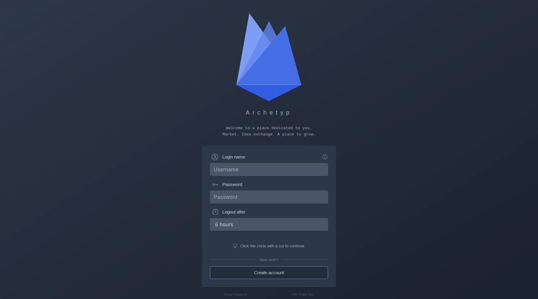
Archetyp Market has a really simple interface and an attractive design in which anyone can navigate and use it. It is divided into the upper panel, the left work area, the central screen and the footer.
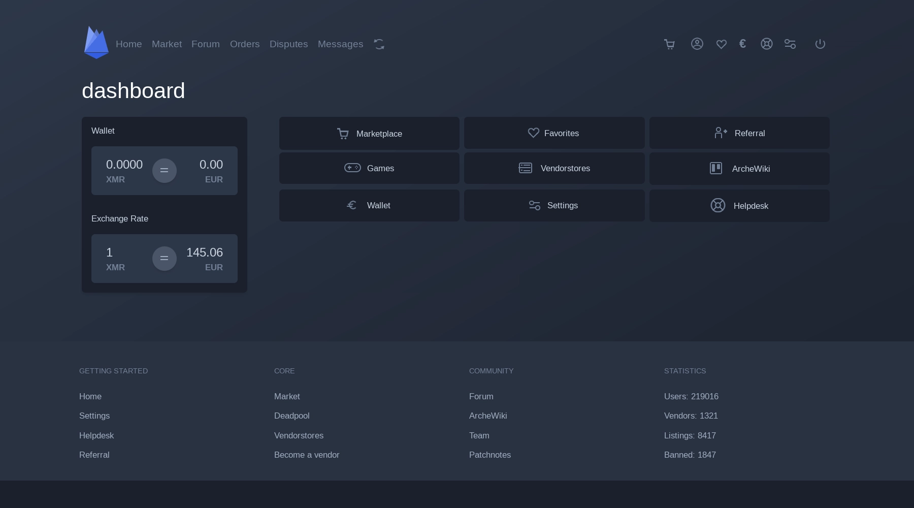
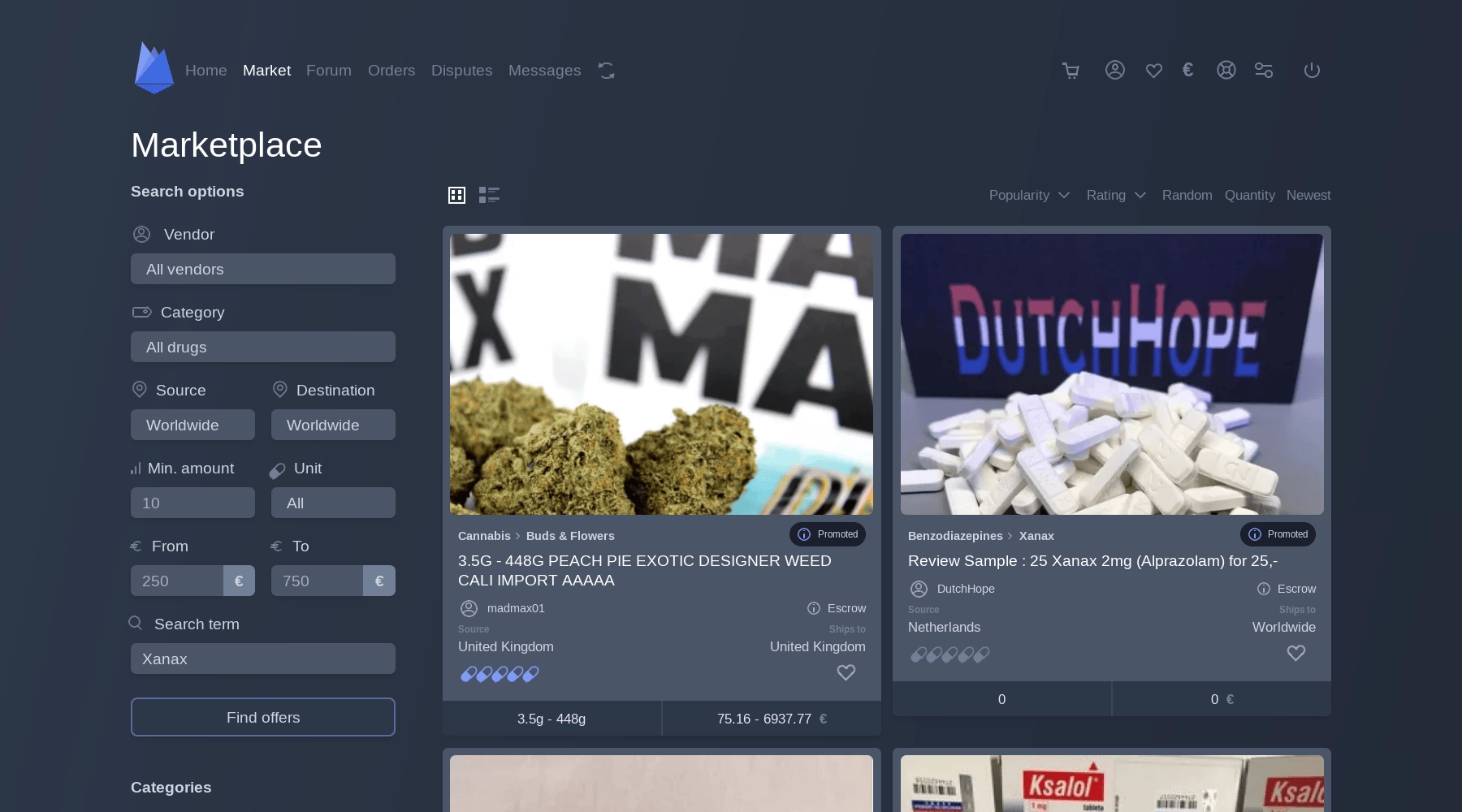
The upper panel contains the main navigation buttons that lead you to the main sections of the trading platform, such as: Home (quickly go to the main page), Market (allows you to display listings and use a search engine), Forum (a place where you can discuss everything related to the market and some general issues), Orders (a page for view your orders), Disputes (a page for viewing your disputes), Messages (a page for viewing your messages).
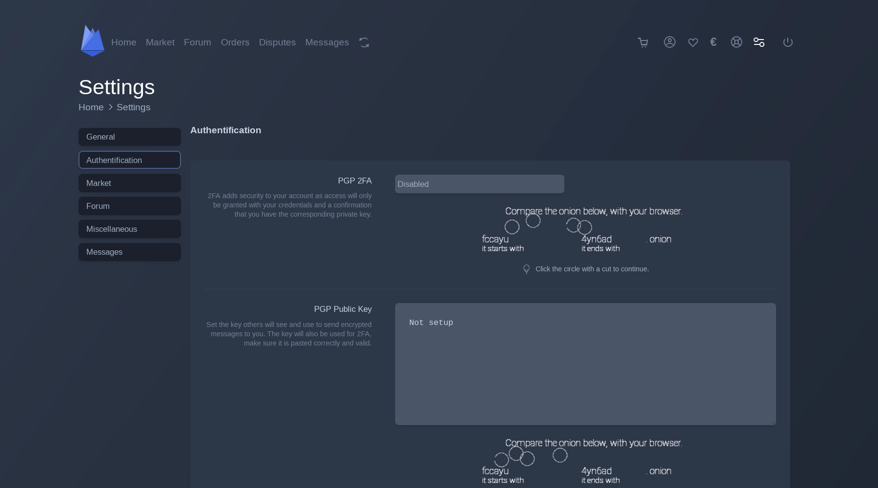
In the right part of the upper panel, the navigation buttons are made in the form of icons that you can click on, here are what icons are presented there and which sections they will lead you to: Shoping Cart, Your Profile (it will allow you to look at your profile as it is seen by other market users), Your Favorite Listings (a page for viewing ads that you have marked as favorites), Wallet (this is the page of your wallet, here you get a deposit address and a withdrawal form), Help / Support (section for getting FAQ and creating tickets), Settings (section for setting up an account), Logout (is not a partition, but will allow you to log out of your account).
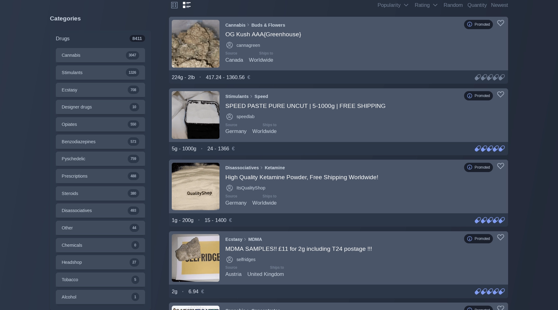
The left panel on various market pages is reserved for different blocks with their own unique tasks, we will look at the left panel for the main page and the Market page, let's start with the first one: Dashboard (a panel for displaying the current balance of your market wallet and displaying the exchange rate). On the Market page, the left area is reserved for: Search Options (a panel for searching and sorting search results), Categories (panel for easy navigation by product categories) and Wallet / Exchange Rate.
The central area of the screen on each page of the market is reserved for what needs to attract the user's attention, since we are looking at only the main page and the market page, let's talk about what is allocated to the central area on these pages.
On the main page, the central area is reserved for navigation buttons that will allow you to quickly get to pages such as: Marketplace, Favotires, Refferal, Games, Vendorstores, ArcheWiki, Wallet, Settings and Helpdesk.
The central area on the Market page is devoted to products from some of the most reliable vendors with the best reviews and reviews, there will also be displayed those products that you are looking for using a search engine or sorting by product category.
The last element of the interface that you need to pay attention to is the footer, it is an additional navigation panel and demonstrates market statistics (Users, Vendors, Listings, Banned), and also as a decorative element randomly demonstrates quotes from great philosophers that looks colorful and unusual.
It would be useful for each reader to take a look at the design and interface of Archetyp Market on their own to form their own opinion on its convenience and attractiveness, but we will not stop there and continue our review!


